
There’s good reason Datadog is one of the most popular monitoring solutions available. The power of the platform is summed up in the tagline, “See inside any stack, any app, at any scale, anywhere” and explained in this chart:
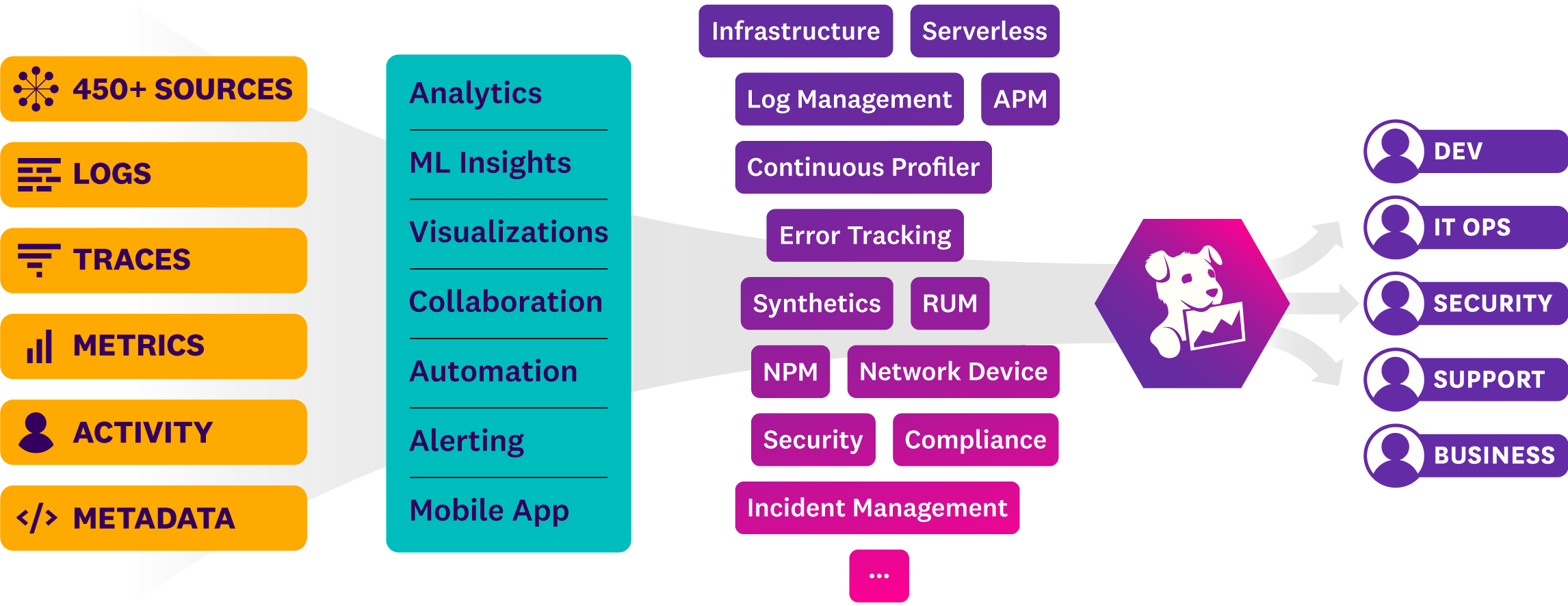
“Datadog brings together end-to-end traces, metrics, and logs to make your applications, infrastructure, and third-party services entirely observable”.
But what the tagline and chart don’t explain is the real-life effort needed to find what you’re looking for. This is especially important when troubleshooting a customer facing problem - where every second counts.
Troubleshooting in Datadog – Example 1
Let’s say your pager just went off because of a critical performance problem that’s been impacting a customer for the last hour. This video by the Datadog team does a good job of explaining what the user did to find the root cause. If you watch from 2:10, you’ll see the process starts by looking at the service map:
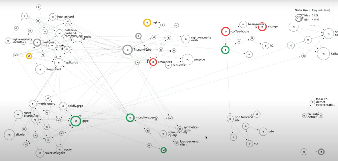
After mousing over each of the red circles and looking at the latency, the user decides that the problem is in the area of the coffee-house service.
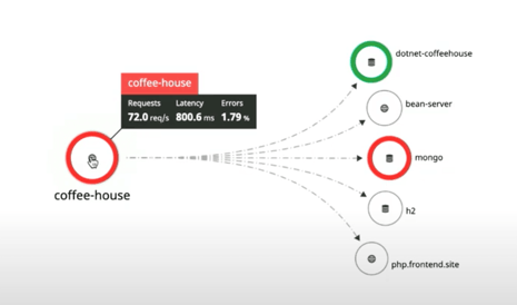
Then, after clicking “inspect”, the user looks at the services coffee-house is making requests to and concludes the problem is with the coffee-house service itself rather than one of the other services. Next, the user makes the decision to “scope down to the exact traces” where the problem is occurring.
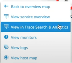
This requires narrowing things down by customer id (the customer who first complained about the issue) and time range, and then inspecting the slowest requests. After clicking around the traces, this stack trace error is uncovered which points to the root cause:

The final part of the video describes some of the other panels available in Datadog like the “logs integration with events panel”, “the synthetics integration” and a panel showing “host id information inline with the trace panel”. And finally poses the question “Is that enough?” as the prelude to announcing a new feature showing runtime metrics in APM. The viewer is left with little doubt about the power and breadth of information available in the Datadog platform.
But was it easy to find the root cause?
The root cause analysis (RCA) process was shown to be quick and easy in the video. But what wasn’t explained is that each step required a carefully considered decision around what was being presented and what to do next.
As new information appeared at each stage, the user needed to interpret the data and then draw on experience, intuition and skill to decide what data was needed next, and where to go find it. Fortunately in the video, each decision turned out to be the correct one, so the entire process was reasonably efficient. However, if the user had taken a different drill-down path at any point, it would have been far more cumbersome.
Even just deciding to start the troubleshooting process with APM and Tracing data and looking at the service map was a specific choice. The user could just as easily have started with any other dashboard or view – and there are lots of possibilities in Datadog! Any other choice would have produced a very different troubleshooting sequence.
While there’s no doubt Datadog made the application and infrastructure extremely “observable”, a less experienced user might have been overwhelmed with all the possible starting points and drill-down paths, and this would have resulted in a far longer and more difficult troubleshooting session.
Troubleshooting in Datadog – Example 2
Most environments that use tools like Datadog make extensive use of alert rules (Datadog calls them Monitors) that trigger when a metric reaches a threshold (this can be a fixed threshold or one that is detected as an anomaly). In this way, the majority of common problems are automatically detected. Here’s an example of an anomaly monitor that I set up to catch possible network problems:
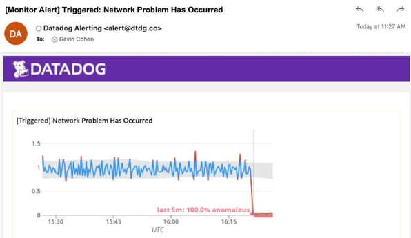
However, this kind of monitor is not actually detecting a network problem, rather it’s detecting a likely symptom of a network problem (network rate anomalies), so further troubleshooting is needed to find the root cause. Using Datadog to troubleshoot this means someone needs to decide where to start looking. Since the cause could be any number of things (hardware, bug, user load change, middleware problem, etc.), a dashboard showing the health of the overall system would probably make sense. This is what it looks like:
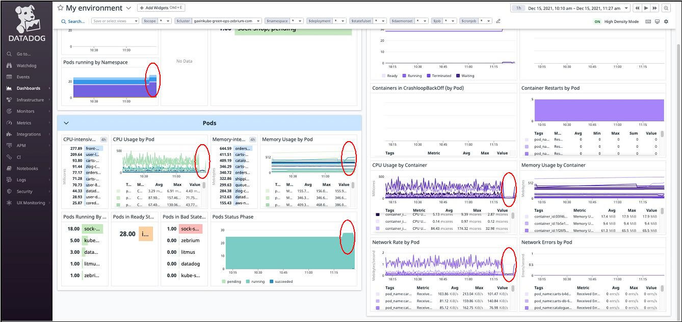
Almost every metric in the chart seems to have changed at around the same time. So where do you go next? Do you drill down and look the details of network rate by pod to see which pod(s) are having a problem? Or do you look at pods running by namespace to see if the increase in pods is what caused the problem? Or would you skip straight to the service map as above? Or??? Again, expertise is needed to figure out what to do.
Troubleshooting in Datadog – Example 3 – Using Root Cause Solver
Now imagine scrolling a bit further down the same dashboard and seeing the Root Cause Finder panel:
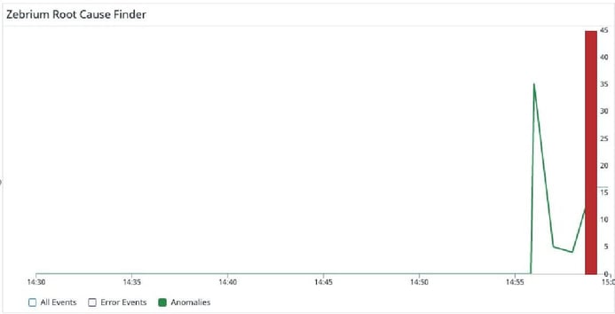
The green line represents anomalies that Zebrium has picked up in the logs. It starts to spike exactly when all the above metrics start to drop. The red vertical bar indicates where Zebrium’s machine learning has detected the root cause of a problem. Clicking the details shows:
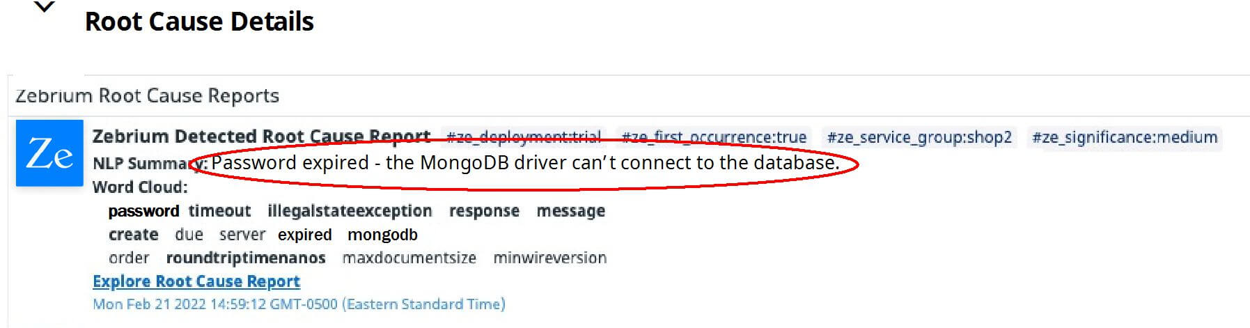
The text circled in red, reads “Password expired - the MongoDB driver can’t connect to the database”. This is the root cause!
What’s different in this troubleshooting sequence is that zero expertise or effort was required. The root cause just showed up in the dashboard automatically!
How did the root cause just “show up” in the dashboard?
Zebrium Root Cause as a Service uses machine learning (ML) on logs to automatically find the root cause of software and infrastructure problems. The ML has been modeled to detect the patterns that occur in logs when software fails. Essentially, it finds clusters of correlated anomalies from across the logs and uncovers 10-50 log lines that explain what happened. It then uses NLP (GPT-3) to summarize them into a single sentence (which is what was shown above).
The technology has an accuracy rate of greater than 90% in correctly identifying the root cause of software failures (this is based on customer testing against hundreds of real-life failures across many different products). The ML does not require manual training or pre-configured rules and achieves accuracy in less than 24 hours.
Here’s a 30 second video that shows what all this looks like:
If you're interested in trying this with your own data, you can sign-up for a free trial at www.zebrium.com.